Project 1: Create 3 low poly items for a game that you might find on a nintendo DS or something else really small.
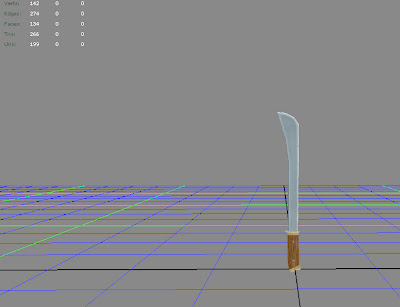
Item 1: create a melee weapon under 350 triangles. I chose to do a mix between a machete and a chinese dao sword.

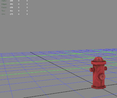
Item 2: create a scene prop under 500 triangles. This amount was later changed to 350 triangles, but by then I'd already done all the work ... so I just deleted some of the bolts and textured in some fake ones. It still came out okay, but not as good as when it had the bolts geometry.

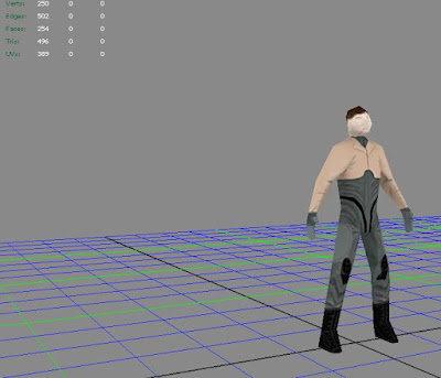
Item 3: create a humanoid under 500 triangles. I found a mech pilot turn around sheet on google, and decided to loosely base my color scheme/clothing design on that character. It wasn't until I was texturing that I realized just how hard it is to paint on a character with enough proper geometry.

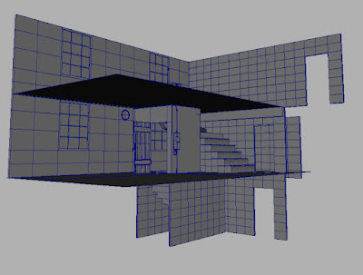
Project 2: after getting approval for a scene, model it out for use in UDK. I went ahead and planned early for vert painting on the walls so that they could be easily reusable without the problem of looking like they're being reused. Our classes never really covered exactly how to vert paint, though they all recommended we use it, so after digging around I found a nice tutorial on how to do hard line vert painting at:
http://www.chrisalbeluhn.com/3D_Tutorials.html
I used his techniques on both of my walls, meanwhile I used a standard soft line vert painting technique on the floor between the sand and the wooden planks.

After everything was modeled out, I slapped some textures on and threw up some quick lighting.

Then I got a critique and was able to identify some problem areas and move on to correct them.

I began playing with glass ...

... and some different angles ...

... but overall it all looked like it was coming together.

Then I fixed the over-saturated light bounce problem, a little bit of scene desaturation ... and a sky dome with some fog blending out to it.

Played with desaturation levels and fog lighting density.
 Then I came upon this nice balance of colors that shows color details and still allows for the textures to blend together nicely.
My final piece looks like these last three shots.


Things I left out was a problem I had with the sky dome and light passing through it to cast proper shadows inside of the room. My project turn in for this piece didn't look as good as this as a result of that. It took an additional two days for me to discover how to fix the problem through an extensive case of trouble shooting and doing render pass after render pass.
No comments:
Post a Comment